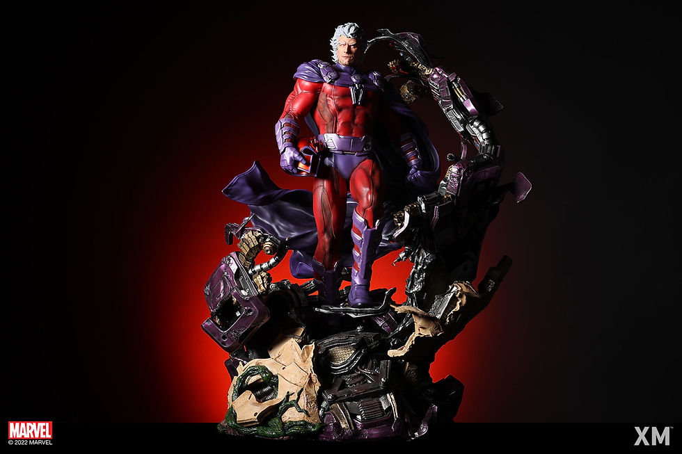
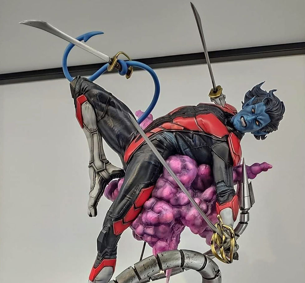
Statue Spotlight: XM Studios Archangel
- Vega

- Aug 7, 2021
- 7 min read
To not impede the rest of the review, I will get the biggest gripe out of my system now. Why, oh why, is always Archangel and never Angel. That is REALLY what I want, a pair of giant, majestically sculpted angel wings in my collection. But I digress.
XM has been building anticipation towards its next round of 1:4 X-Men statues for nearly a year now, with many concept photos beginning to be shared in Fall 2020. Since then, Psylocke, Rogue, and Beast have all seen their pre-order windows open with mostly subpar reactions. From Psylocke's headsculpts and pose to Beast's paint choices and abysmal alternate headsculpt, to Rogue's, well, plainness, it has not been a walk in the park for collectors and their high anticipations. Archangel is not without his critics and has brought his own share of controversy. Let's take a walk along the near year long road of those anxiously awaiting this new X-Men character.
November 2020: Concept Art Reveal

A dozen Wolverines, a few Magnetos, but this is the first 1:4 Archangel and with that came a ton of excitement from X-Men collectors. A character that has a rich history of towing all three lines of hero, villain, and anti-hero, Archangel has the verstaility to fit almost any existing collection. There was a lot to like about the concept art, but also raised a few eyebrows. In typical XM fashion, the costume follows the lead of its comic appearance, but with a few modern touches. These touches can be seen in the lining around the suit's lighter paneling, the increased detail in his gauntlets, gloves, and boots, as well as the break-ups in his wing structuring. These are all details that, for me, exemplify going the extra mile and creating a more unique sculpt than just mimicking whats been seen in other representations. It is also the kind of detail that will get me interested in purchasing a piece that I may have not otherwise be interested in.
Even with its pluses, as all pieces eventually face, there were a few decisions that were highly questioned. First was the pose, with the major critique being that it makes him appear as though he is flying away from something/battle and "retreat" does not feel like it fits the spirit of an X-Men line. I do not personally feel that way, as I think it is just a part of a flyer's fighting-style to get some distance between an enemy. I find it almost religious, as the once dark angel seeks redemption for his sins and reaches for the light and forgiveness from above. I know, a bit too poetic for an X-Men statue. Second was the head scratching about what were described as "Dr. Octopus" tentacles coming through the rubble. It has since been reported that these tentacles pertain to Apocalypse, though I still struggle to see the connection. I assume the full reveal of XM's upcoming Apocalypse statue (an instant pre-order for me based on what's been seen thus far) will shed more light on the nature of these tentacles.
Lying in the wake of the excitement and the critique was an even greater concern that did not take long rearing its ugly head...
November 2020: The Great Color Debate
A mere days after its reveal, word from the art director was that Archangel would have his X-Force (black/silver) color scheme and start a new X-Force line. As the hope for those wanting to add this to their already existing collections, meaning a desire for his classic (blue/magenta) color scheme, a revolution began. Within the span of a day or two, there were two separate polls and a post on XM's community Facebook page sharing the preferences between the two color schemes. Of course, I not only could not stay out of it, I helped supply fuel for the argument by completing a couple of concept colorings (above) as collectors chose their sides. As the demand for the classic colors BLEW the X-Force colors out of the water, collectors (including myself) felt hopeful that something would be done to remedy the demand.
April 2021: Paint Updates

Although collectors made their voices heard at the end of 2020, it would not be until Spring 2021 before we got an answer as to which Archangel we would be getting. It turns out that answer would be...both. As a few paint updates were shared, it was made clear that collectors would have the option between the classic and X-Force verison. I like the shine of the wings and while the X-Force paint looks good as well, I think the application of the classic colors really shines. The deep midnight blue and the dulled magenta with the darkened highlights in the suits folds have quite an appealing impact on the eye. In addition to the paint updates was the inclusion of a headsculpt tease, with it being of the skull head representing Archangel's time as the Horseman of Death. With this reveal, it appeared as though we could assume at least two headsculpts with this statue, the unhelmeted portrait from the concept art and this skull head. As we were hit with the flurry of Psylocke, Rogue, and Beast pre-orders, collectors sat around with empty wallets hoping they would have some time to recoup before Archangel would come around.
August 2021: Pre-Order Coming Soon

Now four months removed from the last update and we have finally been offered a glimpse of the finish line, as the Archangel pre-order was teased to be "Coming Soon" by XM Studios. We get a good look at the contrasting color schemes, which continues to cement the superiority of the classic color scheme or me, as the X-Force appears too two-toned. The biggest news coming from this image is the introduction of another head sculpt, with the promo images donning hooded, screaming portraits. I try not to form hard judgements without having a clear look at things, but that expression comes off looking like a vampire and the red eyes only amblify that feeling. I do hope the headsculpt from the concept art comes to fruition, as I think that is the way I would want to display it more times than not, with the skull face every now and then. Also, it will be interesting to see collector's reactions to the base considering how critical most were of it when initially revealed.
August 2021: Pre-Order Opens
Just a handful of days later and the official pre-order window has opened with full photo sets of both versions of the statue. Comprehensibly, I think it is a good statue that carries a really concise composition that gives it a few cool display angles and captures a lot in a small amount of space. It is well-balanced from the pose of the wings subtly surrounding the circumference of the base and the outreaching arm providing reprieve from the mass of statue at the base and midsection. Speaking of space, the dimensions do not seem quite right based on the pictures. Version A, the classic suit with the danger room sub-base, is measured at 17.5"W x 14"D x 28"H. The Version B, X-Force suit, is measured at 16.5"W x 17"D x 25.5"H. I understand why Version A is taller, but it has 3" less depth which makes no sense considering they appear to be mirror images of each other minus the sub-base.
The statue will retail around $995 USD after conversion, which seems to remain consistent with where XM's 1:4 statues have been and the ongoing increase in prices being seen across the board. The issue here is that while always a bit pricier, you got a high level of concept and quality that could justify the price. I don't find that to be quite the case anymore.
Outside of the overall composition of the statue noted above, I think the highlights for this Archangel are the wings and the overall paint (minus the base). The curvature in the wings and the shine of the silver are such eye-catchers that it helps pull focus away from weaker areas of the piece. Even on what I consider a blander color selection, the black on the X-Force version comes with some depth which is accentuated by the textured panels that help break up the dark monotony. I really like the hues of blue and magenta that the company went with on the classic version, but I do wonder if the dark blue/black in the lowlight areas will end up too dark. The paint-up on the classic, while honoring the comic look, clearly defines this as a slightly more modern approach.
I don't hate the head sculpts, but I feel like each head just missed the mark. The helmeted screaming portrait, which I initially thought would be the worst, is actually the one I most prefer. Even with many criticizing the red eyes, I agree that white might have been better to contrast with the skill portrait, I think it captures the emotion of the stance the best. The non-helmet head sculpt is not that good and I think my biggest gripe is the color of the lips. With the mouth closed, it looks like lipstick and is just too dark, but does not come off as such in the screaming portrait. A slightly darker hue from the face would have sufficed for the lips. Oh, also the shading that makes him look like he's wearing horror attraction zombie makeup is not a winner either. I honestly don't care for the skill appearance that much, so I don't have a strong opinion, but it feels more like a Halloween mask than his face. That is the type of headsculpt I would expect XM to come out swinging with, but alas, it's a tad lackluster.
Here comes the real weak point: that base. I can appreciate how they attempted to tell a different story and offer something different between the two versions, but it would have made sense without the danger room sub-base. As a fan of Egyptian history and mythology, I lvove the inclusion of hieroglphics on the walls of the wreckage. What I don't care for is the cement-like color atop of the walls as it not only contrasts with the walls in a poor fashion and blends too closely with the tentacles, but it is not common in Egyptian architecture. On to the tentacles, which still does not appear to make much sense. They feel so random and even if they are incorporated into the Apocalypse statue base in some way, are likely to still feel askward. It almost makes more sense with the Danger Room base because you can conceptualize it as part of the room's machinery. I amy not have an answer for a better base, but this does not feel like the answer.
Again, overall, I think this is a good statue. But, for a company that was setting the bar with every few statues they released, XM has really mellowed out with the "wow" factor, especialy with their X-Men line.
If you enjoyed this content, please follow Geeky Therapy on Facebook and Instagram to stay up to date with all posts and reviews.


Comments