
Statues 'R Us: Update #1
- Vega

- Apr 27, 2021
- 9 min read
Updated: Oct 8, 2021

As the brainchild for starting this blog peeped its head out of the corner however many months ago, it came with an early expectation that I use some of this platform to discuss the statue collecting hobby. It was an aspect of writing/reviewing with which I was not familiar and while I have offered my opinion on pieces, it was never more than a sentence or two. It has been easy to pump out film and TV reviews/posts since that was my main area of expertise when I wrote for MoviePilot. That experience, plus the natural slowing of my personal collecting with my recent move, has led to the barren wasteland that I labeled the "COLLECTIBLES" section on my blog. Since I am set to not have any statues come in for a long time, I am taking inspiration from some of my favorite statue collector YouTubers and will write a semi-regular snapshot at the recent updates in the statue world. I only plan on including licensed statues and omitting custom/fan art statues, except in maybe some discussion points. Yes, there is a reason for that and it has to do with my mixed feelings about custom statues, of which I may do a post about later.
IRON STUDIOS MORTAL KOMBAT


There is not a company currently producing small scale statues that can touch Iron Studios (IS). Period. Having become best known for their 1:10 scale statues, the company combines great quality and really good details in such a small package. I own Diamond Gallery statues, which are a slightly larger scale and average around $50 and they serve their market well. But for a higher end collector who wants to jump into a smaller line without sacrificing the quality that would normally come with the size decrease, IS 1:10 line is absolutely where it is at. I own their 1:10 Arkham Nightwing and have seen the 1:10 Bane and Endgame Iron Man in person and, wow, it is unbelievable how premiere they feel: a good weight and strong construction.
This past week, in conjunction with the release of the new Mortal Kombat (MK) movie on HBOMax, IS revealed the next additions to their MK line: Scorpion and Sub-Zero. The first pieces in the line, Shao Kahn, Raiden, and Goro (pictured above) have already been available for Pre-Order, with Shao Kahn scheduled to be released first this summer. Both of the new additions have tentative release windows in Quarter 1 of 2022, retail on IS's website for $179.99, and stand about 9" tall.
SUB-ZERO
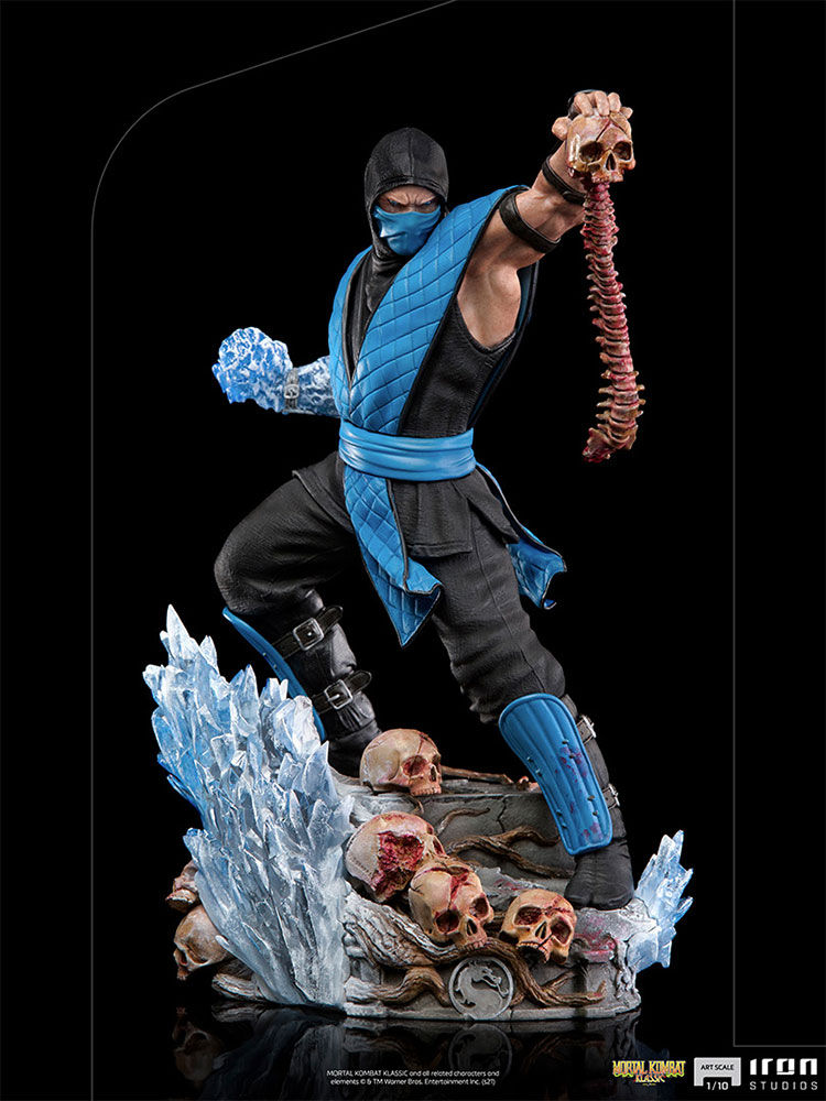
I think the new Sub-Zero is an absolute home run, capturing everything that a representation of the character should have. First, the incorporation of his ice powers on the base are a sweet touch, as are the accompanying skulls. To emphatically capture the violence of the franchise, he is holding a skull and spinal cord after, presumably, using one of his fatalities. My favorite aspect of the piece is him using his ice powers in his right hand, as it gives a subtle nod of motion to an otherwise museum pose with his bony trophy. I really like Shao Kahn on Throne and think that this piece comes close to rivaling it as the best statue in this line.
SCORPION
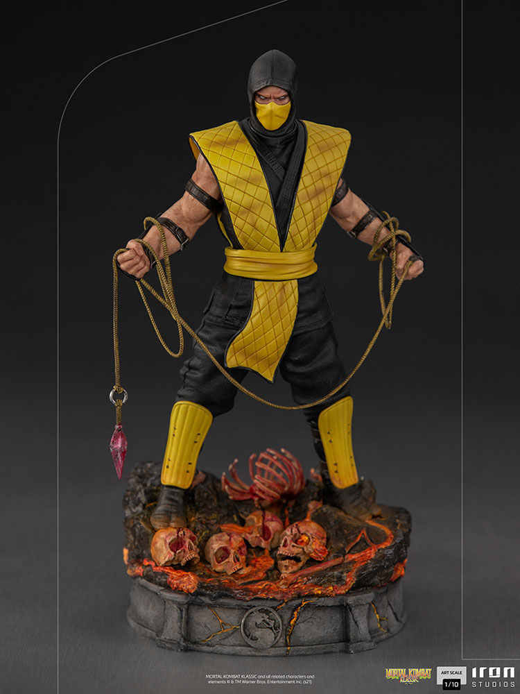
A much more disappointing offering to me is the Scorpion statue. A rival to Sub-Zero since the first game and, thus, can be seen as a companion piece for the Sub-Zero statue. All of the detail and characterization was put into Scorpion's base, with the burned skulls and scorched earth being indicative of Scorpion's hellfire abilities. You know what would have been better? Some indication of that on his body, maybe even in a switch out skull head. I think the character himself is lacking, even though I give them props for having his signature tool present. I think a more effective pose would have been to almost mirror Sub-Zero's stance with Scorpion throwing his blade. Still, not a bad piece, but a lot of missed opportunities put this with Raiden as the least exciting of the line so far.
XM STUDIOS PSYLOCKE
There was NOTHING more frustrating for me this week than the update from XM Studios that their 1:4 scale Psylocke would be going up for Pre-Order. Normally, I am all for a new X-Men statue being released, since mutants are the focus of my collection...but not this one. Psylocke is not a character I care about and it is not something I am looking to drop any dimes on, especially at $900+ for what I consider a B-Level character. This was frustrating because they also have a 1:4 Rogue, Beast, and Archangel that are ready/close to ready for Pre-Order, ALL of which I am interested in. Out of four character, they chose the one... I have come across quite a streak of impatience with only one current statue on Pre-Order, so I thought the door for opportunity was opening. I know that they will go up for order soon enough, but still, the impatience ensues. Now, while I was not anticipating this statue at all, I know that many collectors have been and let me tell you, they were vocal about this one.


My thoughts are that the piece is just average, maybe a 2.5/5 if I were to apply some sort of scale. I think the obvious problems with this piece are the display-ability and the portraits. I really like the sense of motion captures in the pose, but the conventional way of displaying the piece with her head facing forward means losing a lot of the action in the statue. A lot of the body sculpt ends up covered and the action in the base is lost, with the metal band wrapped around her leg. Then the portraits, which XM specifically has received a lot of slack for, are really lackluster. While the company has improved, they still do not capture a life-like sense in their faces and they end up feeling very doll-like. These do not stray from that issue at all, but that becomes even more apparent with near emotionless expressions, as this Psylocke does. There is no consistency between what is seemingly happening in the statue and her expression.


A few of the things I like are the details in the base, the sculpt and paint on the psychic energy, and the details in her suit. While I do not necessarily think a bad base always ruins a statue, a good base can almost always elevate it. When it comes to metal and gravel, nothing gets me more worked up than a lack of color differentiation. My take is always "if you are going to have all of these different parts, why would you just make them all look the same" and XM Studios very much made sure to throw different shades of silver, bronze, and gold on the various metal components in the base. Regarding her suit, I am FAR from a purist and never want to see comic accurate costumes because they are flat and boring. I love texture, and the dual-textured approach to her suit is very appealing, with a mix of smooth and ribbed textures. The one aspect that I think would have been a welcome change is the coloring on the textured portions of her suit. It appears to be black, but could also be a very dark purple, but I think it would have looked better as a slighter lighter/darker hue of purple from the flat portions.
Again, not a piece I am looking to get, so I am kind of glad I do not find it very appealing. Although, that did not stop me from looking at the payment plans with this itchy trigger finger I have been having for a new piece. I have seen conversation about the positioning of her left leg and how unrealistic it is. I get collectors having some expectations of characters being grounded in body proportions and movements, but these are comic characters who do unbelievable things. She should not be able to end her leg that way? You know what else she should not be able to do? Create a blade with psychic energy...but here we are.
SIDESHOW COLLECTIBLES GALACTUS MAQUETTE
Saving the best for last, here was the biggest controversy in collecting since...well, the last thing collectors wanted to turn into a controversy. In a span of two weeks, Sideshow Collectibles (SS) first drops a surprise tease for a new Galactus Maquette and then puts it up for pre-order. In the same two week span, many collectors started out on a high for one of the most popular cosmic characters, especially with the new Silver Surfer Maquette being released, only to end on a low with disappointment.

I think the concept for the statue is done well and captures the essence of Galactus as the World-Eater, with the base depicting a decimated city. Not being as familiar with the character, I am unsure what the energy/fire around his hands is supposed to represent, but it does help indicate that he is causing the destruction. While there has been some negative feedback about the suit design, I think it has a lot of slick details and like the futuristic feel it gives off. It is not as though it is THAT far off from his comic-accurate costume, as he looks pretty ridiculous regardless. The LOUDEST complaint comes from the size. Galactus eats planets, so you can imagine how big he is, so a statue that could represent such a character well would conventionally be thought of as pretty large (but still manageable). The last Galactus Maquette released by Sideshow back in 2013 was 33" tall, so I think it was reasonable for collectors to expect this one to at least match that size, especially with the improvements in engineering and the ease of sizing adjustments with digital sculpting. At 26", Galactus will be similarly sized to most 1:4 statues and I can see how that would make such a large character appear very off.


Other than the size, I think the weak spots for the statue come mostly from the paint choices. First, the character is overwhelmingly blue and there is either not enough purple on his body or the purple used is too dull, hell, maybe its both. At the most basic fix, just maintain the pinkish-purple of the helmet throughout the dull purple components. Secondly, speaking of how a good base can elevate a piece, this base is doing the statue absolutely no favors. I think I saw someone describe it as melted cheese and not I can not unsee the overly burned cheese spread over the buildings. It would greatly benefit from their being more differentiation between the molten aspect and everything else. Sure, one could argue that this is what a planet looks like in the comics just before being fully consumer by Galactus, and to that I would say, then the art director chose the wrong phase to be represented in a standstill image. There is just a lot of blue and burned cheese that overwhelms the color palette. Below, I will post a couple of color mockups I did of the suit and base that represent the improvements I discussed here.
(In my mock-up [right], the pinkish-purple from the helmet is carried through the other purple panels of the suit and the purple of his chest/obliques/shoulders was made a bit brighter.)


(In my mock-up [right], the glow of the lava was reduced, creating a greater contrast with the gravel/buildings panels. The overall base was darkened, which gives a more lifelike coloring to the lava, as well as a more charred look to everything else.)


PRIME 1 STUDIO KONG BUST
There are many unfortunate people in this world, such as though who have chosen to side with Kong over the almighty Godzilla. Nah, just kidding (not really). A few weeks after the full reveal of their Godzilla bust comes its companion piece. Following the same design template as the Godzilla, this chest up bust sits on a detailed base with a mini-scene of the character. Lookin away from the base for a moment, details appear to be the key for victory in Prime 1's approach to Kong. From including his chest scars, the cut on his left ear, an wrinkles in his face, I am hard-pressed to find any corners that have been cut when developing this prototype. The glass eyes give a bit of a life-like feel to Kong, as well as an expression that gives the bust a bit more personality than a stoic face would have provided.


As I specified above, this is the prototype and my biggest concern with this piece, one that does not exist for Godzilla, is the production of the hair. Prime 1's facebook page indicated that "our craftsmen have meticulously hand-punched each of his hair strands, one by one, into his silicone and polystone understructure". While there is no Edition Size yet announced, I doubt that the factory workers constructing this statue will meticulously hand-punch each strand of hair into every one of these busts developed.


Still unsure whether it is a good thing or a bad thing, the shining element of both this and the Godzilla bust are the highly detailed story bases. The base for Kong includes wood of the walls that surrounded the village from Kong: Skull Island on the sides and the, now, iconic scene of Kong sitting on his throne in Middle Earth. Two problems come with such an amazing base concept. First is that the base can overshadow the bust itself. While the bust is amazing and packs in a lot of details in its own right, it is really the size that serves as the wow factor. The base tells a story and, thus, can be considered a more complete representation of the character. Also, it provides a display concern because the back of the base would traditionally face a wall, or at least away from the typical eye-line. With this bust, you will want to find a way to display this in a 360-degree manner and that can be tricky. Regardless of whether you have a centered display or a rotating turntable, this is a bust that all King Kong fans should be considering.

As we continue to draw closer to the summer conventions, when we usually see new pieces from most of the licensed companies, I hope that we will get a few more X-Men pre-orders from XM Studios. Unless there is an influx in new statue reveals before the July conventions, I am sure to say more about my thoughts on custom statues in the next Statues 'R Us Update.

Comments